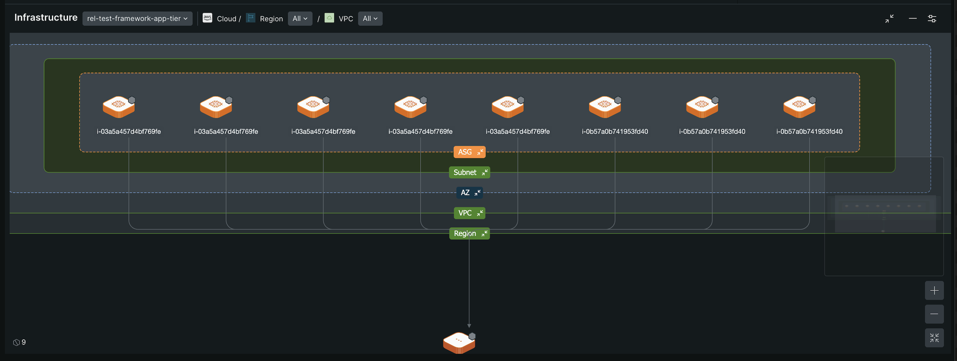
Maps provides a unified and integrated view of your cloud estate, allowing seamless navigation and exploration of services and infrastructure. It integrates tracing, infrastructure, and performance data into a cohesive experience, addressing limitations of the Service map experiences.
Comprehensive visualization: View your entire digital landscape that shows all your services and infrastructure in one place. This visualization helps you quickly grasp complex architectures and make informed decisions about your cloud environment.
Automatic Resource Detection: With auto-discovery, Maps automatically identifies new resources and their relationships. This feature ensures your data is always current, reducing the time and effort needed to manually update and track changes in your cloud estate.
Service map (old) vs. Maps
Feature
Service map
Maps
Focus
View one service at a time.
Gain a comprehensive view of multiple services, enhancing overall system understanding.
Navigation
Navigate through individual services
Explore the entire cloud topology, including AWS resources, from a holistic view of the entities and their relationships.
Grouping
Not available
Organize entities in multi-level grouping for simplified visualization and management.
Infrastructure visibility
Limited context on infrastructure.
Directly inspect AWS and cloud resources, providing deeper insights into infrastructure support.
Service relationships
See direct interactions between services.
Understand complex interactions for better dependency management.
Health status summary
Basic health indicators
Filter services by health status to focus on critical, degraded, or uninstrumented services.
Customization
Basic appearance settings
Tailor map view and edge styles to suit specific needs, improving clarity and focus.
Availability
Maps is available for all Full platform users. On the Data + Core Compute pricing model, all users are Full platform users and have access to Maps. Core and Basic users in a User pricing model continue to get the old maps experience.
If you're a Full platform user and want to switch back to the old maps experience, click Switch back for now from the map view.
Maps access across capabilities
You can access Maps from various New Relic capabilities. Some capabilities provide Maps access by default, while others require enabling additional features through the Feature Control Manager.
Maps is a read-only experience. All Full platform users can access Maps without any additional roles.
重要
There are no create, update, or delete operations available within Maps. For more information on the overall SAI role model, refer to SAI Getting Started.
Map components
Get familiar with the components of Maps, which visualize the relationships within your services, resources, and teams, and show their health status.
The entity from which you open the map. It serves as the reference point for visualizing relationships with other entities one step away.
To view comprehensive details about the entity, point to the focal node and select the info icon.
Connected nodes
The connected nodes are entities that have a direct relationship with the focal node. They appear one step away from the focal node.
Inbound nodes: These nodes send data to the focal node and appear to the left and top of the focal node in the default view.
Outbound nodes: These nodes receive data from the focal node and appear to the right and bottom of the focal node in the default view.
To view comprehensive details of a connected node, point to it and click the info icon. To open the map of that node, from the Related entities section in the right panel, click See full map.
Edges
Edges illustrate the inbound and outbound relationships between nodes. Point to an edge to view the relationship type and the data flow direction.
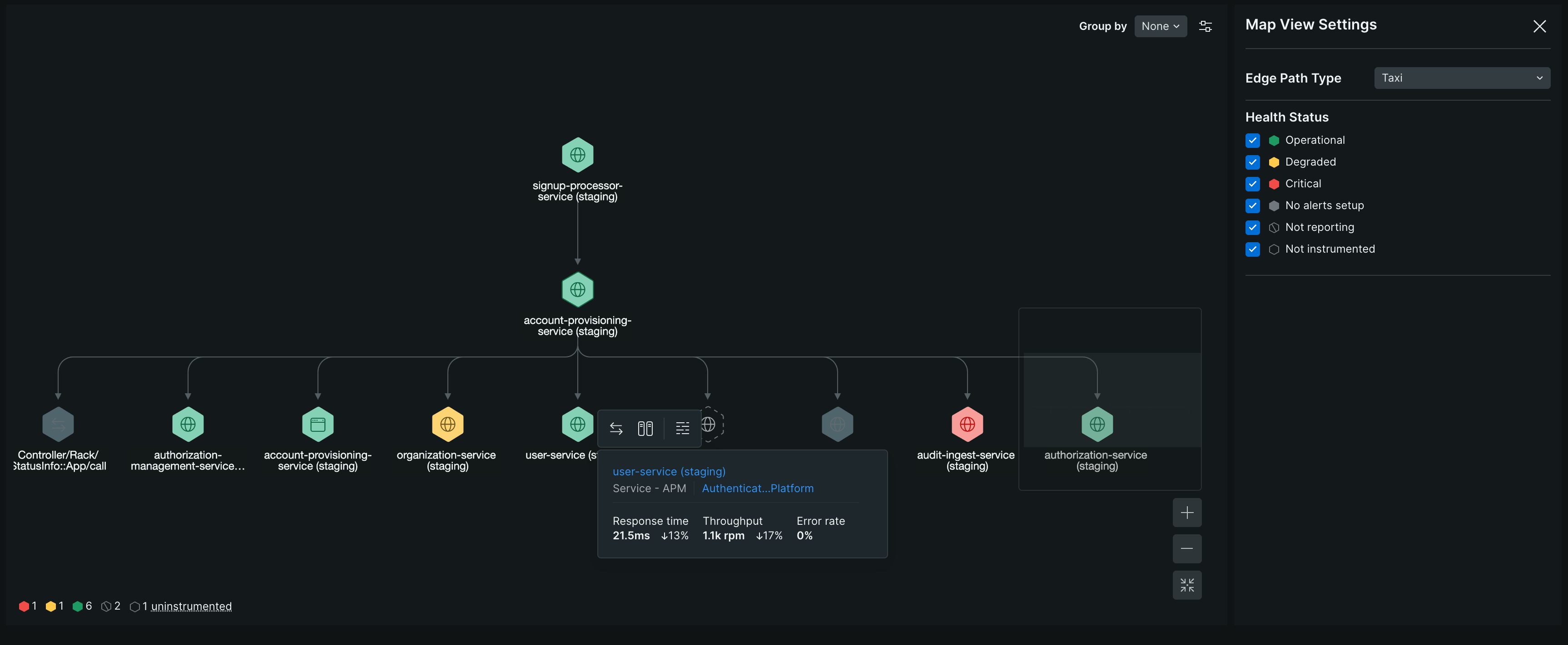
You can change the edge style from the Map View Settings panel by using the Edge Path Type drop-down.
Legend
The legend, next to the zoom controls, lets you hide specific entity types you don't want to see on the map.
Zoom controls
Adjust the map view by zooming in and out or centering and resetting the zoom level. If nodes are outside the main viewport, the map thumbnail provides a compact overview to help navigate and locate the nodes. As you zoom in, the map reveals more entity details. Entities with errors or anomalies stay labeled and visible at every zoom level.
Health status summary
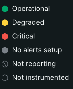
The Health status summary provides a quick overview of node statuses, using color-coded indicators and counts to help you identify areas requiring attention. You can instrument uninstrumented nodes directly from the status summary.
Service level availability (SLA) indicator
The SLA indicator appears if the availability percentage of the node drops below the SLA threshold. Pointing to the indicator displays the current availability percentage.
To learn more about the SLA, refer to Service level availability commitment.
Clusters
Cluster is the logical grouping of nodes that simplify the map by consolidating related nodes. A cluster forms when at least 10 nodes:
Share the same parent node.
Have the same relationship type.
Belong to the same entity domain and type.
Exhibit the same dependencies (inbound or outbound).
A cluster displays the number of nodes it contains, and the color of the cluster depends on the health status of the nodes within.
Red: At least one critical node
Yellow: At least one degraded node but no critical nodes
Select a cluster to view the nodes in the right panel of the map. Reveal nodes from the panel to display them individually on the map outside the cluster.
Nodes
Nodes represent all types of entities in the map. To visually distinguish between different types of nodes, and recognize their health status and SLA, the map uses the following icons:
Services, micro-services, and internal code
Data and integrations
External services
Mobile applications
Browser applications
Video player
Degraded node
Critical unknown node
Node with no alerts set up
Not reporting node
Uninstrumented node
Node with dropped SLA indicator
AI nodes
AI nodes represent AI agents and the tools they use. The map uses the following icons:
AI agent
AI tool
Infrastructure nodes
To distinguish infrastructure nodes from service nodes, Maps uses the AWS Cloud Infrastructure icon set and color palette:
Analytics
AI/ML
Application and integration
Compute
Container
Database
IoT
Management and governance
Networking and CDN
Security
Simple Queue Service
Storage
Other
Kubernetes nodes
When you traverse a Kubernetes entity in the infrastructure map, Maps uses the following icons to represent Kubernetes resource types:
API server
Cluster
Deployment
Node
Pod
StatefulSet
Visualize relationships
Maps uses different visual patterns to represent relationships between entities, depending on the type of relationship. This keeps the map readable as your architecture grows: primary relationships stay visible on the canvas, while secondary details remain available on demand. To see these patterns applied to a specific trace, refer to Understand the trace details UI page.
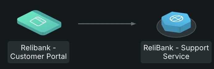
A directed line with an arrow is the default way Maps represents a connection between two entities, showing the direction of data flow. For example, if Service A calls Service B, an arrow points from Service A to Service B. Most service-to-service relationships on the map use this pattern.
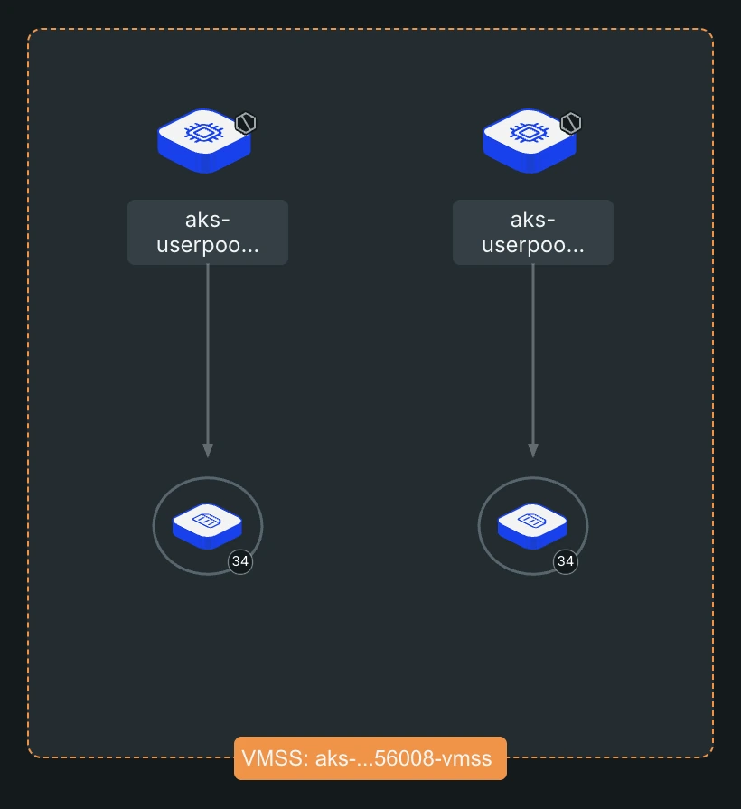
Some relationships represent containment rather than data flow. For example, a database cluster contains its instances, and a Kubernetes deployment contains pods. Representing containment with a directional line would incorrectly imply data flow where there is only structure.
For entities with a Contains relationship, Maps automatically groups them inside a boundary box, with the parent entity visually wrapping its children. This shows the hierarchy without requiring you to read labels or follow arrows, and reduces the number of edges on the map.
Some relationships fan out too widely to draw as individual lines without cluttering the map. For example, multiple Kafka brokers can manage a single Kafka topic. Drawing a line to every broker would make the topic look more complex than it is.
For these Is managed by relationships, point to the entity to view the full relationship detail in its popover, instead of adding permanent lines to the map.
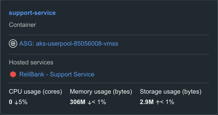
For example, the popover for a container lists the auto-scaling group it belongs to and the services it hosts.
Some relationships are relevant but secondary, and apply to nearly every entity. For example, most services have a service level attached to them. Drawing a line from every service to its service level would dominate the map with edges.
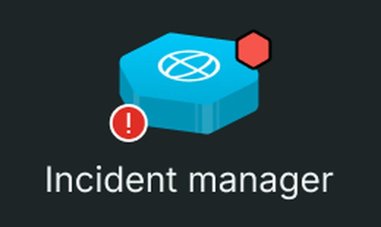
For these relationships, Maps shows a small overlay icon on the entity node instead of a line. A yellow or red icon at the top right signals that the entity is alerting at Warning or Critical health status. An icon at the bottom left signals that the entity isn't compliant with a service level objective or indicator. Point to the icon to view the relationship details.
Map entry points
Maps provides a consistent mapping experience accessible through various entry points. Depending on the type of entity you select to explore, separate views are available to show services, teams, infrastructure resources, entity relationships in a workload, or dynamic data flows. This unified approach offers clear insights into service interactions, infrastructure dependencies, team operations, and data flows.
Maps enables you to visualize relationships and dependencies among services within mobile, browser, and APM environments. In its default view, the map displays only the services. Selecting a service node reveals its associated infrastructure resources in the bottom panel.
To access the map for mobile, browser, and APM environments:
To open the issue page, from Issues & Activity, select the issue that is associated with a service (Check the Entity name column).
To get the service map, from the issue page, scroll to the Impacted entries section.
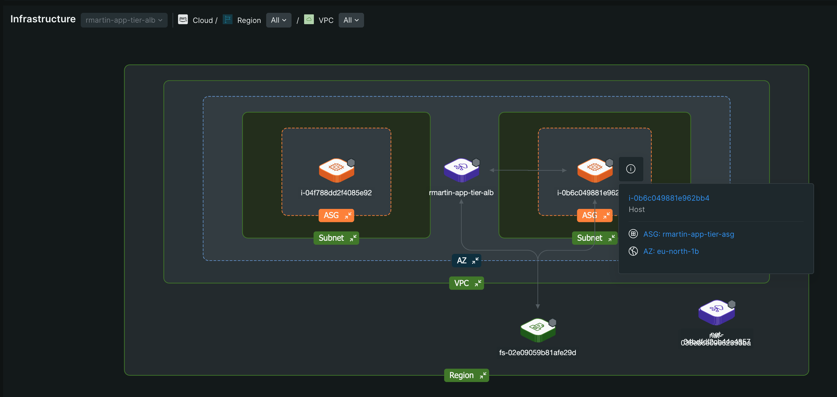
Through Maps you can explore infrastructure resources and their internal relationships. It provides a detailed view of how infrastructure components support your services, enabling you to directly inspect AWS and cloud resources. The map helps you understand the underlying infrastructure dependencies that are critical for maintaining service performance and availability. With AWS Auto-Discovery, you can also view the internal relationships between AWS services.
From the All entities page, select the host you want to view.
To open the map, on the host page, click Infrastructure.
To access the infrastructure associated with entities on the map:
From one.newrelic.com, open map for any service in APM & services, Mobile, Browser, or Workloads.
To open the Infrastructure Map, point to a node and click Inspect infrastructure.
Or
From the Infrastructure drop-down at the bottom of the map, select the nodes you want to inspect, and click Apply. The infrastructure map opens at the bottom of the map, displaying the associated infrastructure nodes and their internal relationships.
Through Maps you can view team-specific services and their interactions. It allows you to explore services and dependencies within the context of your team's operations, facilitating collaboration and efficient management of team-owned resources.
To get the details of a team, from the Teams page, select the team.
Go to the Map tab.
The Dynamic Flow Map offers a detailed view of data flow through your services, including interactions with databases and other backend components. It provides insights into performance and potential bottlenecks, allowing for effective troubleshooting.
Maps illustrates the relationships and dependencies among entities within a workload, as well as between different workloads. They provide a comprehensive view of these relationships, including the health status, SLA, and data flow. Maps also depict hierarchical relationships when workloads are nested within one another.
Maps with Distributed tracing and Auto-Discovery provides unified relationships between entities. While Maps remains functional even if you haven't enabled Distributed tracing or Auto-Discovery, enabling these features is recommended for a more impactful and consistent experience.
Use Maps
With the features and components of Maps, you can explore and manage your cloud environment in the following ways:
The Health status summary provides a quick overview of all nodes. Each health status is represented by a color legend, with a number next to each legend indicating the count of nodes in that status. This allows you to quickly assess and address areas needing attention.
ヒント
In the Map View Settings panel, green represents operational nodes for health status filtering, and the green legend at the bottom-left of the map provides their count. However, on the map, operational nodes do not have a green dot, as this is considered the default state of a node.
Instrument the uninstrumented nodes
If there are any uninstrumented nodes in the map, they appear with a dotted border. To instrument a particular uninstrumented node, point to the node, click Instrument, and follow the on-screen instructions.
You can also get the list of all uninstrumented nodes in the map and instrument them as follows:
From the health status summary of the map, point to Uninstrumented and click Instrument what's missing.
On the Add more instrumentation page, follow the on-screen instructions to instrument each entity.
After you instrument the nodes, the map refreshes to show the updated health status.
Filter nodes by health status
If you want to focus on some nodes with specific health categories, filter the nodes as follows.
To open the Map View Settings panel, from the top-right of the map, click Settings.
From the Health Status list, select the specific status you want to view. The map view updates to show only the nodes with the selected health status.
Manage clusters with health status
If clusters are available in your map view, you can filter nodes in it by health status and display them separately. Point to a cluster and reveal the health status to show nodes with that status outside the cluster. This helps you focus on specific nodes within the cluster.
You can group nodes in the map to reduce clutter and highlight relationships, making it easier to identify patterns and manage dependencies. This structured approach provides a clear and organized view of your cloud environment, tailored to your specific needs.
Create groups
To organize nodes by a specific attribute in the map, go to the Group by drop-down and select the attribute.
To get the grouping on the map, click Apply. Each group displays the number of nodes it contains.
To add another level to the group, from the Group by drop-down, click + Create a group > select an attribute > Apply. The first level attribute forms the primary group, and the second level attribute forms sub-groups nested in the primary group. You can apply up to five levels of grouping.
Group appearance and naming
Groups are named based on the selected attribute. For example, if you are grouping the nodes by the Account attribute, the group name appears as Account: <account name>. Groups are color-coded according to the health status of the nodes within them, as follows:
Red: At least one critical node
Yellow: At least one degraded node but no critical nodes
Select a group to view the details of the grouped entities in a table at the right panel. You can also expand groups to view the nodes and nested sub-groups within them. As per your requirement you can reorder group levels by shuffling attributes in the Group by drop-down.
Maps provides several features to help you explore relationships, dependencies, and metric and team details of an entity. When you point to a node on the map, a pop-over appears with the following interaction options, and three golden metrics. You can use these options to navigate and explore the map further.
Expand dependency
To view the dependent nodes of any node on the map, point to the node and click Expand dependencies. That node becomes the focal node, revealing all one step away dependent nodes with connected edges.
Inspect infrastructure resources
To view the infrastructure resources associated with a node, point to the node and click Inspect Infrastructure. The infrastructure map opens at the bottom of the map, displaying the associated infrastructure nodes and their internal relationship two steps away from the APM service.
If you have enabled for the Auto-Discovery feature, you can explore how AWS services connect internally. The map provides a hierarchical view that follows the order of resource organization: cloud > Region > VPC > Availability zone > Subnet > Auto-scaling group > Individual host. You can select a specific region or VPC to view the resources contained within it.
View dynamic flow
To view the data flow through your node, including interactions with databases and other backend components, point to a node and click View dynamic flow. The dynamic flow map opens, providing a detailed view of data flow through the node, including interactions with databases and other backend components. For more details, refer Dynamic Flow Map.
View node details
To view the details of a node, point to the node and click the info icon. The comprehensive details of the node appear in the right panel.
Access node owner
To access the owner of a node, point to the node and click the team name. The team page opens, displaying the team details and the entities owned by the team.
Access the node details
To view and adjust details of a node, point to the node and click the node name. The entity summary page opens, displaying the entity details.