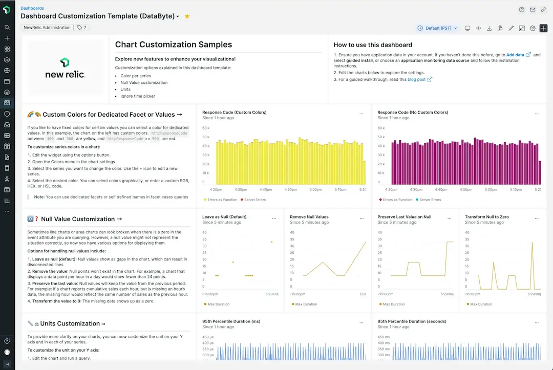
New chart customization options
New Relic dashboards let you analyze telemetry data across your entire stack, regardless of the source. Dashboards are a flexible way for engineering teams to visualize data however they want by combining pre-made templates, native platform visualizations, custom queries, and more—all in one place.
Now there are more ways to upgrade your dashboards, including:
- Markdown widget: Add rich custom content to your dashboards such as links, checklists, tables, and text formatting.
- Custom colors: Highlight key information or choose a preferred color palette for each data series.
- Null value options: Four options to display, transform, or remove null points.
- Unit labels: Increase chart detail and clarity with custom units per series.
- Override time picker: Analyze different time ranges in a single dashboard.
See it in action
Check out the video below to see an interactive demo:
See some use cases and how to make the most of the Markdown widget:
Try it yourself with the template dashboard

You can explore the customization options by following the steps in this hands-on blog. It shows shows you how to import the pre-made template dashboard, describes each option, and demonstrates how to use them in your own charts.