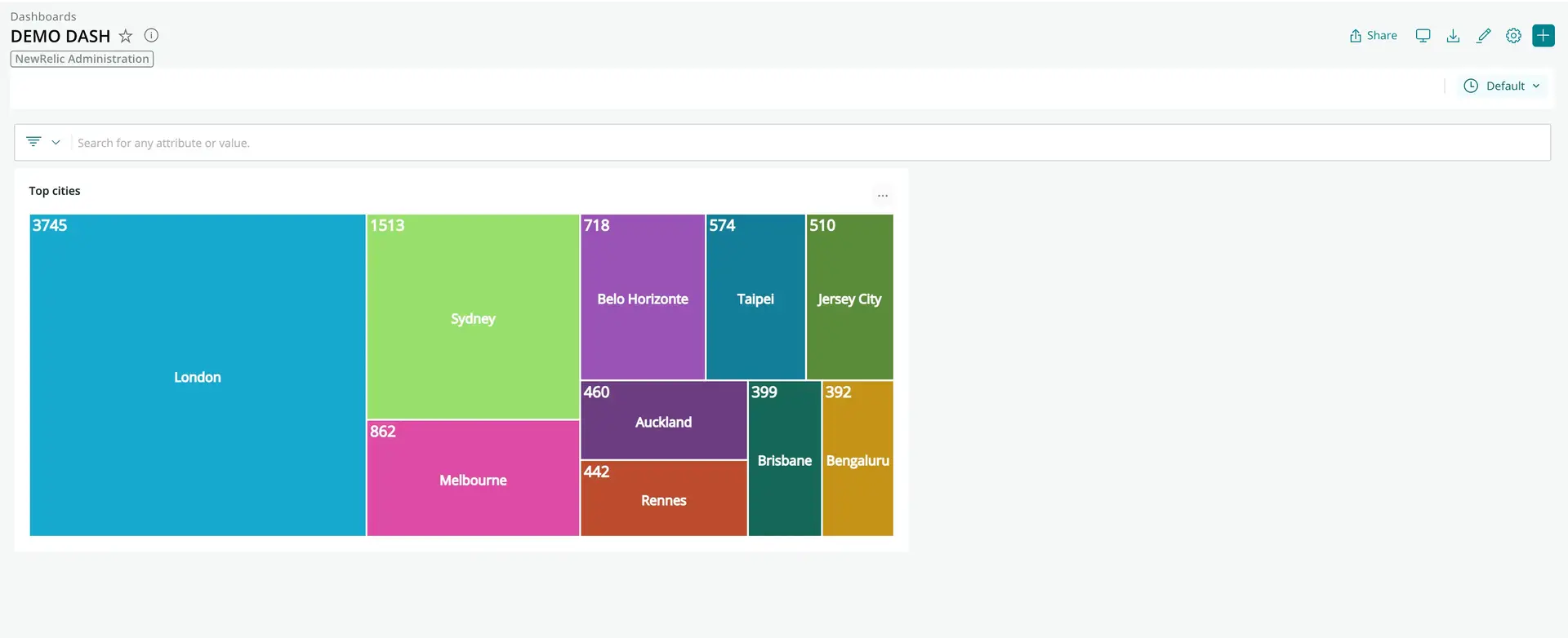
You can build your own visualizations and add them to a dashboard. This gives you great flexibility around what you display on dashboards, from a company logo to custom queries from any data source.

This visualization shows the number of people in each city who are viewing New Relic within an organization. The visualization was created using the New Relic CLI and Treemap from the Recharts library.
The process for creating a visualization is covered in the guide, Build a custom visualization for dashboards.
Add a visualization to a dashboard
You can add a visualization to a new or existing dashboard.
- Go to one.newrelic.com > All capabilities > Apps > Custom visualizations. (If you don't see the Custom visualizations tile, use the search to locate it.)
- In Custom visualizations, select the visualization you want to add to a dashboard and then enable it.
- If there are configuration options, fill those in. The visualization will update with your changes.
- Click Add to dashboard and then select a dashboard from the list of available dashboards, or select New dashboard. If you decide to create a new dashboard, select the account where you want to run the dashboard, and give the dashboard a name.
- Click Add to dashboard, then click the link to your dashboard to see the custom visualization.
Manage your dashboard visualizations
Deleting: To remove a visualization from a dashboard, click the ellipses button in the right-hand corner of the visualization and click Delete.
Editing: To edit a visualization from a dashboard, click the ellipses button in the right-hand corner of the visualization and click Edit.