Dashboards are a storytelling device that let you control how your data is viewed for a particular audience. If a team is tasked with solving anomalous behavior, you can create a dashboard that's specific to those team's needs. The reasons for creating a dashboard are numerous, but each one boils down to improving a troubleshooting process.
Objectives
This tutorial shows you different ways to add data to dashboards. You will:
- Learn how to find and install prebuilt dashboards
- See NRQL queries create different charts, graphs, and tables
- Add a new metrics query from the Metrics Explorer
Add custom dashboards to your New Relic account
Install a custom dashboard
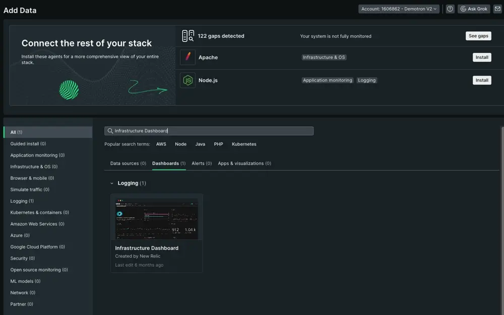
You can shop around for prebuilt dashboards within the New Relic UI. These dashboards give you a jumping off point for customizing your own. If you're new to our dashboards, however, we recommend starting with our Infrastructure Dashboard.
Click View all.
Search Infrastructure Dashboard from Infrastructure & OS.
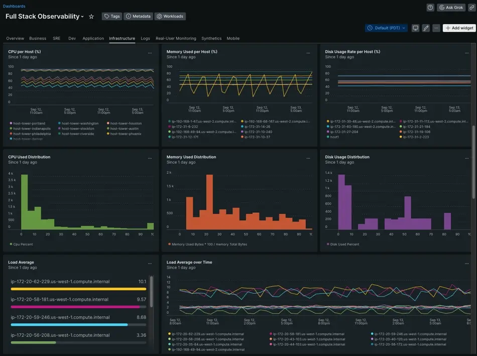
Unlike our infrastructure UI, this dashboard displays your host data relative to each other. This can establish baselines for behavior, help you decide what kinds of you need from those behaviors, and build a story around observed patterns.
Use NRQL to create a widget for your dashboard
Each widget within a custom dashboard is made up of NRQL queries. Like a SQL query, NRQL is designed to let you control and manage data stored in our database so you can present your data to meet your individual needs. Let's explore how you might create a widget to build a particular data story.
Identify the problem you want to solve. For example, you have certain processes that are consistently high resource consumers, but these processes are distributed across different hosts.
Experiment with NRQL. You need to decide the best format for presenting this data visually. NRQL lets you create line graphs, tables, pie charts, or time series.
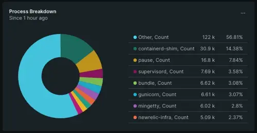
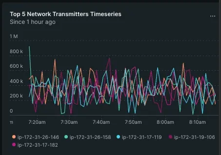
Here's an example of how two NRQL queries create two different charts:
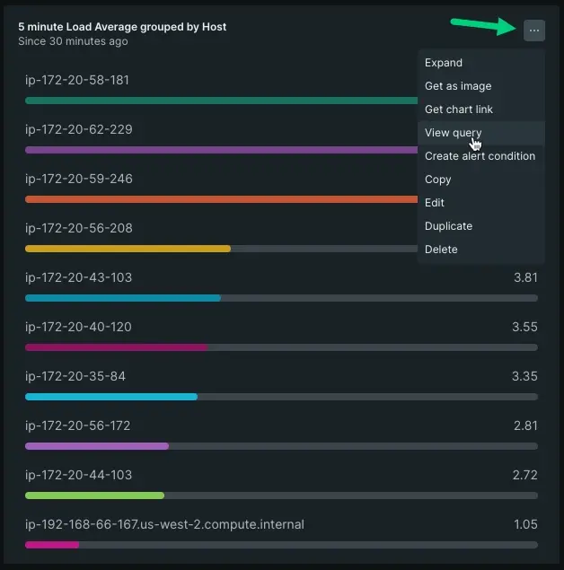
SELECT count(*), average(threadCount), average(cpuPercent), average(cpuSystemPercent)FROM ProcessSample FACET commandName SINCE 1 hour agoAdapt an existing query to create new widgets. You can do this by clicking the ellipses on a graph you want to mimic and selecting View query.
Sugerencia
If you want to learn more about writing NRQL queries, see our NRQL tutorial.
Add metrics from the Metrics Explorer
You can find specific metrics you might want to add to a dashboard via our Metrics explorer. There are a few different ways to access the explorer that depend on what you need. To view all metrics for all your data sources, go to one.newrelic.com > Metrics & Events.
If you're just getting started, we recommend you add metrics from an individual source. For example, let's say you want a widget about a specific host that often exceeds a CPU threshold:
Go to one.newrelic.com > All Capabilities > Infrastructure, then find your host.
Open the host-scoped summary page.
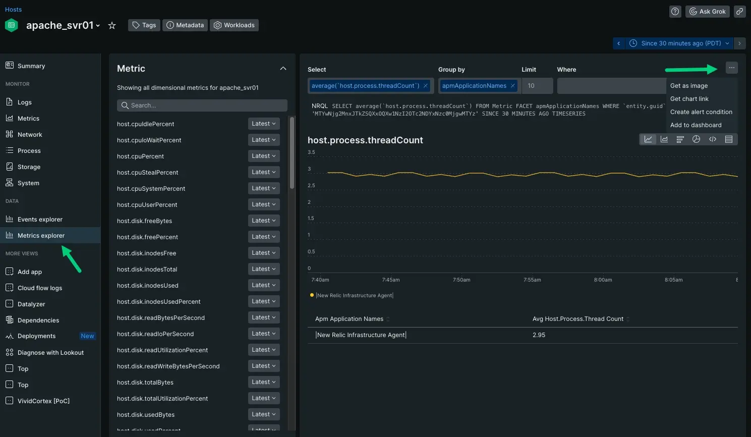
Click Metrics explorer. Choose the metric and dimensions you want the graph to represent. For our purposes, we've chosen
host.process.threadCountand have grouped it byapmApplicationNames.Click the ellipses and select Add to dashboard.
This is good practice if you're using a prebuilt dashboard as a template, but want to add additional charts to it.
Check your dashboard as part of your workflow
Once you've designed and shared your dashboard, it's time to observe your data. Dashboards have as many use cases as there are stories you want to tell. We recommend using them for these use cases:
Establishing patterns between data sources to correlate a root causes
Sharing data across separate teams
Scoping data to squads assigned specific tasks
To explore our existing prebuilt dashboards, we recommend starting with our instant observability page.
What's next?
In this tutorial series you learned about:
- The guided install process for the infrastructure agent and how New Relic captures data about your system
- Identifying failing hosts and apps using only infrastructure metrics
- Going deeper with your data to interpret infrastructure behavior to resolve an outages
- Dashboards that tell different stories with your data
With these skills, we recommend you go deeper with your data:
- Do you want to learn how to monitor Kubernetes? Check out our Kubernetes tutorial.
- Do you want to improve the quality of your alerts? Our alerts tutorial teaches you the anatomy of an alert so you can build a better alerting strategy.

